“Just write every day of your life. Read intensely. Then see what happens..."Ray Bradbury on writing Ok, so there won't be a post everyday, but this is where I'll be sharing short stories about my adventures as an artist and student. Check back here for the latest updates by clicking the subscribe button below. In an InstantSeveral years ago, I noticed the something strange in an area of photography that I didn’t think would ever happen in the 21st Century. I was minding my own business, taking photographs in Covent Garden in London, when a young lady from the Eastern Asia tapped me on the shoulder and asked if I’d take a picture of her and her friends as a souvenir of their visit. “Of course, no problem!” was my response, which quickly turned to confusion when she handed me her camera. Being a gentleman of a certain age without any children, I had little idea what Hello Kitty! was as a brand, although a future trip to Tokyo would sort that out. I looked at this little cat-shaped plastic thing with some bemusement, until the penny dropped that it was a Fuji Instax camera. I had been aware of Instax (it first came out in 1998) for a while, but until then had never shot with the format. I duly pointed the cat camera at the girls, who by this time had worked out which pose they liked best and pressed the button. Everything had been taken care of automatically and a small print, a little bigger than a credit card, popped out of the side. I was immediately taken back to my memories of Polaroid as the girls excitedly waited for their picture to develop. A couple of minutes later they thanked me and went on their way. Nearly a decade later and Instax is hugely popular around the world, consistently being one of the highest selling photographic products in Bezo’s empire. The younger generations are attracted to its ‘social value’, the fun of creating something and watching it appear before their eyes and the way that the physical result can be handed out to friends. Prints have always had the same appeal for me, but they require a lot of work – this all happens…in an instant. Some years after Hello Kitty! I decided to have a go at instant photography myself, but again being someone of a certain age, I was more interested in Polaroid. The problem was the gradual disappearance of Polaroid both as a legendary brand and as a set of technologies. Their highest quality offering, the peel-apart type film, was discontinued many years ago and only Fuji were manufacturing a compatible stock for countries that used it for passport photographs. When the last of those moved over to digital in 2016, Fuji also discontinued their film. Since then, cameras that shoot if have become worthless and the remaining stocks of the film ruinously expensive. Even though I do own two cameras and a stock of the rare film, my first foray into instant photography was the more familiar integral or ‘spit-out’ film that people of my generation grew up with. However, that was also initially a bad news story. Or so I thought. Back in 2008, a small group of entrepreneurs led by the charismatic Florian Kaps had acquired the last working Polaroid film factory in the Netherlands. The company’s decline was well known, but Kaps’ vision was to keep the famous integral film alive for future generations to enjoy in a similar way to Instax. His start-up company, called The Impossible Project, went from strength to strength, keeping up with pop culture with its cool borders and accessories, much like the Fuji ‘themed’ cameras. More importantly as far as I was concerned, they started buying up and restoring old SX-70 Land Cameras, which were perhaps the best of the instant bunch. I have to say that it ranks as one of my favourites in my collection because, well, just look at it!
When Impossible started making their new film, there were changes. Gone were the worst of the environmentally-damaging chemicals and sadly as a result, the ability watch it develop because of its new process. There were now only 8 prints in a pack instead of the traditional 10 and It was more expensive than before, but isn’t everything? That said, the results retained the look of the originals and had that analogue imperfection to them. Unlike Fuji Instax, which had consistently great colours and tones, Impossible was more unpredictable, which frustrated some but excited many as every picture had a uniqueness to it. So successful was the film revival that Impossible bought the rights to the Polaroid name in 2017 and became Polaroid Originals. Both Polaroid and Instax have their fans and the experiences of shooting them are rewarding for different reasons. Instax is cheaper and more stable, but for me the own-brand cameras aren’t great. Despite some valiant efforts by third-party manufacturers, the film is still way better than the cameras that shoot it. Polaroid meanwhile, is bringing out better and better versions of the film as well as some interesting new takes on their classic cameras, offering phone integration and printing capabilities. They also maintain their programme of restoring and selling vintage cameras from the 1970s and 80s. If you pick up one of the vintage SX-70s that works or has been restored like mine, you get the nostalgia factor and the quality to go with it.
Polaroid Originals B&W shot of the Elgar mural in Malvern
Lotus sports car shot on Fuji FP100c peel-apart film
Whichever brand appeals most, I would certainly encourage anyone who hasn’t tried instant film to give it a go. In a world where we are surrounded by digital images displayed on phone screens, it’s important to remember that part of the joy of photography is the making of something tangible. Not saying that digital is a bad thing, but few people print their pictures these days. There is something magical about being able to take a picture and give it to someone within minutes, making instant film every bit a conversation starter as a Japanese cat camera. Getting started with a camera and are stuck on automatic? Personally tailored tuition can help. Drop me a line at [email protected] for more details.
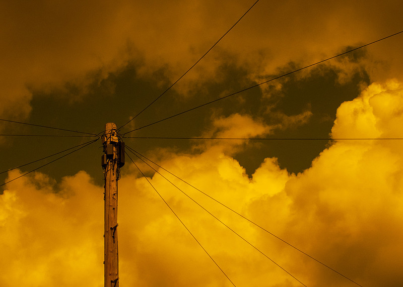
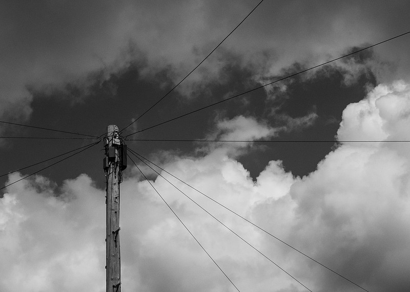
Thinking in Black and WhiteHas anyone ever said to you “You’re so black and white”, meaning that you are extremes with no in-betweens? If they have, you’ll be relieved to know that this post is nothing to do with that. It is in fact about one of my photographic pet hates, the act of randomly converting digital images into black and white. It’s nothing new or course, but I see it more and more on social media platforms where the photographer has added a ‘filter’ to their upload with little regard for what’s in the frame. The other common occurrence is when a photographer isn’t happy with the impact of the picture (impact is one of those nonsense words used to describe photographs – see my last post about elements and meanings) and tries to make it more interesting by converting it. Thing is, taking either approach doesn’t necessarily do anything for the image, in fact for me it often makes the result less interesting. The problem as I see it is not thinking in black and white. Unlike my opening question, black and white photography is far from just extreme black and extreme white. There are many more grey tones between them that the human eye can discriminate and while there is a great deal of research and debate about how many we can resolve, it’s accepted that it could be as many as 900. The grey tones we see in a black and white photograph are dependent on the amount of light reflected from the subject as well as the colour (wavelength) of that light. In the early days of photography, photo-sensitive materials such as film were responsive to only certain colours in the scene. These orthochromatic films were generally sensitive to the blue region of the spectrum, while attenuating everything in the red region, playing havoc with outdoor scenes where the blue sky appeared overexposed (very light grey), and the actors underexposed (very dark grey). Early filmmakers had to experiment with set design, costumes and even make-up to ensure that when the film was exposed, everything appeared as the cinematographer intended. In those days, watching a movie being produced would have been a strange experience with the exaggerated white makeup and bright paint used to lift some surfaces. As technology advanced, panchromatic films were developed that were sensitive to much more of the visible spectrum which meant a more balanced response to light, but with many shades of colours now looking similar when represented by the film’s greyscale. The look of a movie could further be controlled by fitting colour filters to the lenses (more on that later), but the key thing that had to be considered was ‘what would this scene look like in black and white?’ Hence the idea of specifically thinking this way. For example, imagine you saw a woodland scene where the light was dull or flat and the greens had a pleasant but subtle variation to them. You take that picture in colour and look at the result. The image will represent what you saw and your brain discriminate between the subtle changes in colour. If that picture is turned into black and white, those variations become less clear because essentially the scene is green and being represented by relatively few grey tones. Now, if the sun comes out and lights the trees e.g streaming through the canopy onto the ground, then that image would look different as a black and white photograph. The difference is the introduction of more highlight and shadow, in which the subjects are more vividly presented as contrast. Now the intensity of the reflected light is uppermost in our minds and the colours of the trees less important. Thinking in black and white then is more a consideration of contrast and tone rather than colour and what appears to work in one doesn’t necessarily work in the other. Ansel Adams, perhaps the greatest ever technical photographer, used to hold up a Wratten 99 filter to his eye when viewing a scene. The filter effectively reduces the image to its tones, flattening the colours momentarily while the brain attempts to compensate. For a brief moment though, Adams could see what the scene would look like in terms of black and white tones in order to set up his shot. Once he’d done that, he could consider if he wanted to use a colour filter on his lens to enhance particular areas of the picture based on the colour of the light being reflected. Colour filters, pieces of glass or plastic fitted to the end of the lens, effectively control the light hitting the film or sensor by only passing colours in the spectral region around its colour. For example, red filters pass light in the regions of the red/orange/yellow spectrum, while green pass regions of green/blue/violet. The impact of a filter when the image is black and white is how the colours are represented as grey tones, namely the passed regions look lighter in the image, while the attenuated regions (the ‘complementary colours’ on the colour wheel – see link below) look darker. Another effect of changing the way the tones are represented is on the contrast with some filters, such as red and orange increasing it considerably. Take the example below.
"…in the sense that the negative is like the composer’s score. Then, using that musical analogy, the print is the performance". – Ansel Adams There are some great modern digital processing plug-ins that replicate the effects of lens filters, but for me they don’t replace the need to pre-visualise the shot before pressing the shutter button. Taking our time to look at how the subject is lit, thinking about how to bring out the best in the composition when converted, then employing some techniques in-camera, really helps our understanding of image making. So next time you’re hovering over that ‘just do it’ button, ask yourself whether it make the picture look any better. With a little pre-visualisation beforehand, it just might. For more information about colours and complementary colours: https://www.canva.com/colors/color-wheel/ For Ansel Adam's work: Fancy learning more about filters and the way they affect photographs? There is an introduction to their use in my core modules for beginners. The core modules give you everything you need to get started in this wonderful hobby. Find out more by dropping me a line at [email protected].
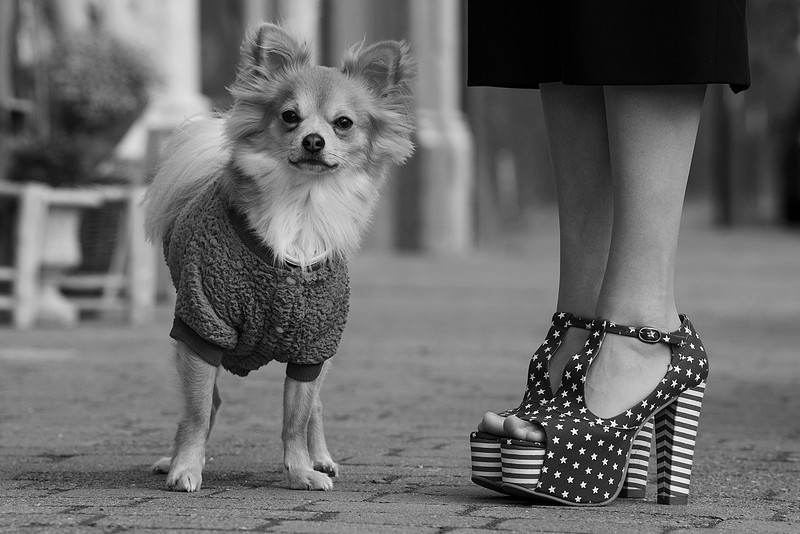
As you ‘like’ itAs many of you know by now, I am currently studying for a BA(Hons) degree in Photography. It’s part-time so a long old course, but I am meeting and working with some very interesting and talented people along the way. During a recent student meet-up, we started discussing the idea of ‘liking’ a photograph. Our course leader had previously, and light-heartedly, banned the word ‘like’ from our discussion, noting that it had no relevance to a structured analysis of the potential meanings of an image. We were well aware that very few people consume photography in this way, I mean imagine if you stopped to study every image you were presented with, nothing would ever get done! The idea of ‘liking’ a picture for some reason vs. the artist’s intended and deliberate messages contained within it, is something that interests me because I occasionally run into the sometime conflict between them. I have to say that it still frustrates me, although I am getting better at appreciating where my influence ends and the viewer’s ‘ownership’ of the interpretation begins. A good example was during a recent course exercise where I had to recreate an image in particular genre (see my previous post The Importance of Method, published in March). I chose an iconic portrait by Elliott Erwitt from his book Dogs (2008). The picture had to break down the elements of the portrait and recreate them in new composition.
The main difference between the original and my shot was the reworking of the ‘American-ness’ of the image. Erwitt’s was shot on a New York sidewalk, which contributes to the scale relative to the dog and his owner. With the best will in the world, I couldn’t make a street in Malvern look anything like New York, so instead I changed one of the other elements; the owner’s shoes. In using my wife’s outrageous Stars and Stripes heels, I could introduce the ‘place’ without spoiling the composition. In every other respect I tried to make the image a recreation of Erwitt’s, despite it being shot with different technical approaches, technology and being separated by some 76 years. When I shared the picture around social media, the first (and most popular) reaction was to the shoes. I had messages asking who made them, where they could be bought etc, which for me missed the point. However, it was clearly what resonated with them, and I have no right to be grumpy about it. We look at a picture and we are struck by any number of elements that mean something to us. It could be a memory, or something that we are currently familiar with, or it could just simply make us smile. Whatever the thing we see, it’s as relevant as artistic analysis of composition and the reading of a picture using semiotics or other analytical tools. Analysis allows us to gain an understanding of the many connotations or meanings that an image may have. We can recognise how the photographer has included their own personal perspective on a subject, whether emotional, social or political, but fundamentally it is the viewer that develops and completes their own narrative. In my picture, I unintentionally added a new element of glamour that wasn’t in the original. The chihuahua is the same breed but looks very different and almost complements the elegance of the legs and shoes. While it’s not what I was trying to achieve, it’s interesting to hear what people see. In considering this, I was reminded of a great piece of advice that I was given by a previous tutor. He had criticised me for only researching artists whose work I ‘liked’ and disregarding those that I did not. He pointed out that this habit doesn’t lead to any kind of expansion of our understanding or appreciation of art, instead keeping us comfortable with what we know. I am definitely a creature of habit, just ask the Indian restaurant where I order the same thing every time. I started to look at artists that I wasn’t keen on and carefully studying their pictures. I was pleasantly surprised how I gained more of an appreciation and respect for their work.
Thinking of taking up photography as a hobby? Have you bought a new camera and are stuck on Automatic? Tuition could be the way forward. My beginner’s tuition takes you through the basics of how the camera works, which mode to use, lens selection etc, all aimed at helping you take better photographs. Drop me a line at [email protected] for more details. For Elliott Erwitt’s original image https://www.magnumphotos.com/arts-culture/art/elliott-erwitt-dog-dogs/
The Rise of Face ValueI was watching the news recently, something I try to avoid doing for long periods these days, because of some of the truly awful things going on in the world. The ongoing news item that has taken on the name Partygate was being discussed and I found myself looking at the viral video footage of the Labour party leader drinking a beer in an office. Now, I’m not discussing the political issues at the heart of this story, whether any of the politicians broke Covid restrictions etc as that is for others to write about. What interested me about this piece of video was more about the way it was being used in the news broadcast. The video, around 30 seconds in length, shows Sir Keir Starmer standing by a window, drinking a beer. There are other people present in the room, but the video is of fairly poor quality they are more difficult to see clearly than he is. We can see their positions relative to Starmer and, apart from recording them having some form of conversation, there isn’t much else of interesting in the video. On the surface, the video shows a gathering indoors during a time where the rules in the UK stated that we couldn’t do that – this rule-breaking is the whole premise of Partygate. However, the news item made the claim that the video ‘proves that rules were being broken’. Leaving aside the politics of the news outlet, this is clearly not the case. On its own, it merely shows an event happening without context, whose legality or otherwise is the subject of an investigation. This got me thinking about how we increasingly take visuals at face value, extrapolating what we believe to be obvious when paired with a persuasive argument. I wondered how we got to this point and whether it’s a symptom of the modern age. We’ve all heard the saying ‘the camera never lies’. This myth has its origins in the very beginnings of photography, with the early pioneers like Fox Talbot and Daguerre seeking to faithfully produce ‘drawings’ of things. In Fox Talbot’s case, he was frustrated by what he saw as his lack of drawing skill, producing early photograms of plant structures using his new photographic technique before considering the camera. Photograms involved placing a translucent subject on a piece of photo-sensitive paper and illuminating it with a light source. The light passing through (and being obscured) by the object creates an image of the structure of the object onto the paper as highlights and shadows. This idea of the photography producing accurate images was the dominant view of the art world at the time, with many disregarding the medium as being mechanical and therefore not art. In the early 20th Century, the use of photography to record events gave birth to the ‘documentary’ genre, which is where some of the most noticeable doubts about photography’s ‘honesty’ can be seen. In the 1930’s the US Farm Security Administration embarked on a project to document the migration of farm workers from the deprived rural areas to the cities during the Great Depression. The series that was produced included works by many famous contemporary photographers, perhaps the most famous being Dorothea Lange’s Migrant Mother. The series sought to show the US people and the states legislature that there was this huge suffering in large sections of the rural population in an effort to get them help. It’s said that the publication of the photographs and accompanying writing ultimately helped thousands of impoverished farmers. What wasn’t common knowledge at the time was that the narrative was very carefully managed. The editor, Roy Stryker, was known for his close attention to editing the pictures in such a brutal fashion that those not fitting the narrative were badly damaged using a hole punch so that they couldn’t be printed. The discovery and subsequent printing of the destroyed negatives gives us an insight into what Stryker was trying to avoid, including images of farmers smiling at the camera, children at play and compositions that showed the defiance of the poor. None of these things supported what Stryker wanted to say. The camera then, was accurately capturing what was put in front of it, but the use of the results was tailored for a target audience with a very specific message. That message wasn’t necessarily the whole truth, particularly in the case of Migrant Mother, but that didn’t matter. The camera didn’t lie, so the readers took the pictures and the accompanying narrative at Face Value. When we think about Partygate in the context of ‘documentary’, this use of the visual being bent to suit a narrative is no longer a surprise. Starmer has been highly critical of similar behaviour on the opposing benches so, in a way to balance the argument, certain press outlets are bound to use a video like this one in their counter-argument – who wouldn’t? Is 'face value' a modern affliction? No, of course not. Photography has been associated with the notion of truth for its whole existence, but the subversion of an idea such as the ‘perception of truth’ often creates the most interesting art (I’ll discuss the artists who inspire me in upcoming blog posts). What is a symptom of the digital age, however is the ease with which we can all ‘document’ something with our smartphones and instantly share it with the whole world. The seemingly infinite narratives that can be derived from one or more of these documents are up for grabs. In the case of the Starmer video, it offers a narrative to one side of the argument more than the other, one that suggests hypocrisy. This is why I’ve limited my consumption of the news, because it’s so easy to be taken in by a persuasive narrative that is not the whole story. Perhaps the consumption of many different news viewpoints on a subject is the way to combat the bias, but to be honest I personally find it to be anxiety-inducing and who needs that in their life? One thing is for certain, the camera is a tool who’s use in capable hands can be a little dishonest when needs be. If you’re interested in the ‘truth’ of Lange’s famous Migrant Mother, my friend and fellow artist has posted a great telling of its story on his Youtube channel ‘Before the Shutter’:- https://www.youtube.com/watch?v=kLXRMNlxxec&t=24s Similarly, the Killed Negatives exhibition mentioned can be found here:- https://www.whitechapelgallery.org/exhibitions/killed-negatives-unseen-images-1930s-america/ Finally, if you’re interested in telling your own stories, true or otherwise, through photography then why not start the journey with some tuition? My tailored beginner’s tuition will help you become familiar in the basics of photography and you’ll be shooting documentary in no time – just be careful shooting through people’s windows. Drop me a line at [email protected] for more details.
I procrastinate; therefore I am (maybe)A couple of months ago I started the next level of my degree course. It’s been an interesting ride so far, but the new unit promises to be much more involved creatively. In addition to this, the course is structured differently from the previous units, which I knew would present me with some issues. The main issue would be the dreaded procrastination. When I don’t fully understand something that I have to do, I procrastinate to the extent where there have been times I just haven’t started. It’s not fear as such, but a need to completely understand the parameters that I am to work within. Once I get started on something, I usually fill in the blanks as I go along. During the first few units of the degree, I found that I would slowly make my way through the first assignments and hit my stride about halfway through the course. By the end, I would be completely comfortable with the subject just before the unit ended and the whole cycle started again. Procrastination, as Dickens put it “is a thief of time”, the main effect being that it increases pressure when we have a deadline we must meet. It takes many forms but the main driver behind putting things off is a concern about a potential negative outcome. In my case, it’s about worrying about being on the right track or somehow ‘getting it wrong’. My most recent example was the preparation for the first assignment of this new course. The subject investigates the concepts of photographic genre and the conventions that each follows. If we consider portraiture, there are many approaches to representing our subject or model using their facial features, expression, stature, clothing etc. that are consistent across the genre. Some of these are rooted in art history, but some are unique to the medium of photography. Looking at each of the main genres involved a great deal of reading and individual research. The question that kept going through my head was ‘how much is enough?’ At what point should I draw a line under this work and write the essay that constituted Assignment 1? The answer was, of course, entirely up to me which was the main issue. Not knowing when to stop the one task and start the other led to my procrastinating. I found lots of other less important things to do and before I knew it, three weeks had gone by. It was my fellow cohort members that snapped me out of it as I was able to relate what I was doing to how they were approaching the assignment. I finally got the assignment finished and a great weight lifted from my shoulders. It’s not a pithy success story, though. I continually struggle with procrastination for the reasons mentioned earlier and I don’t have a magic bullet for avoiding it. There are a few things that I have learned recently that have helped, though. I include them here, on the off-chance that they help you in some way. The first lesson learned was one that generally applies to people who manage their own time; having a plan. When I say plan, I’m not talking about a grand ambition like making that first million or retiring at 55. Planning in this case is merely a schedule of what to achieve during the day. In my case I have learned that progress, no matter how apparently insignificant, is still progress. If I make my objectives achievable each day, I stand a better chance of getting something done. The second was that the world is full of distractions, some positive and some not. To the procrastinator, a distraction diverts attention from both the task and the worry related to it. It’s easier to avoid something challenging by cleaning that camera/reading the news/looking at that funny cat video on Instagram. Most of us carry around a device packed with distractions which we find difficult to ignore. The same distraction issue occurs with people, who can easily derail the plan for the day without knowing it. I still need to be better at saying ‘no’, even if the distraction is a potentially enjoyable or interesting one. The final lesson was to stop worrying about failing. In the creative world, it doesn’t matter if that internet pedant corrects you or someone trolls your work when they don’t like it. The fear of people hating what we do almost paralyses us from a productivity perspective. Remembering that we do it for ourselves helps quash that anxiety, even if it doesn’t completely go away. All easier said than done and for me, definitely work-in-progress. My advice would be to plan small objectives and don’t forget to reflect on anything you achieve, turn off your phone and practice the ‘can we do that some other time?’ smile. Definitely don’t read ‘the comments’ if you do stray onto social media. I am committing to doing these things from now on…or will that be next week? Who can tell…
If you’ve been procrastinating about getting to know that new (or new to you) camera, why consider some beginners’ tuition? There is everything you need to get started, the key is just…well, you know. Check out the Tuition tab on this site or drop me a line at [email protected] for more details.
|